Project Brief
During the Fall 2019 semester, I worked with Cerner, an American supplier of information health solutions, on a project as part of our Experience Studio course at Purdue University. With the implementation of new communication technologies in healthcare such as the electronic medical record (EMR), the quality of communication in the healthcare environment has decreased. Therefore, we were encouraged to come up with a solution that would bridge any disconnect in understanding between patients and healthcare providers.
Given the project prompt, we focused on encouraging college students to reach out to healthcare resources early at the onset of illness to better support them in their recovery. From personal experience we knew that many students were not satisfied with visits to the on-campus health center, Purdue University Student Health Center (PUSH). This was an area of improvement we identified to help alleviate existing communication problems.
My Role
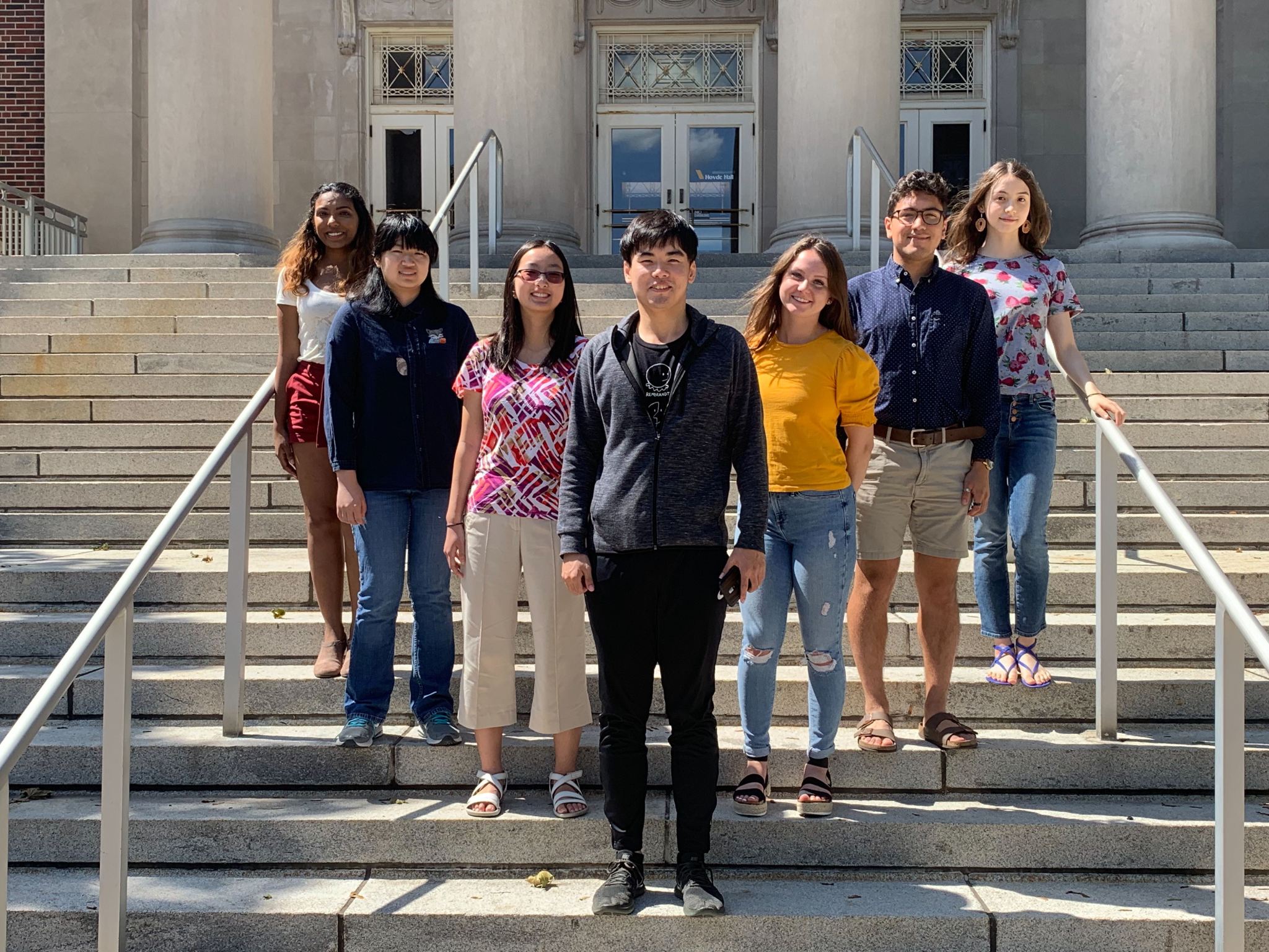
I was part of a team of six UX Design students. I helped our team familiarize ourselves on topics relevant to our project through extensive online research, including studying current healthcare modes of communication (EMRs) and problem areas with existing solutions. In doing so, I established the finalized problem statement approved by sponsors as well as built a persona that accurately reflected the needs of our user group.
Solution
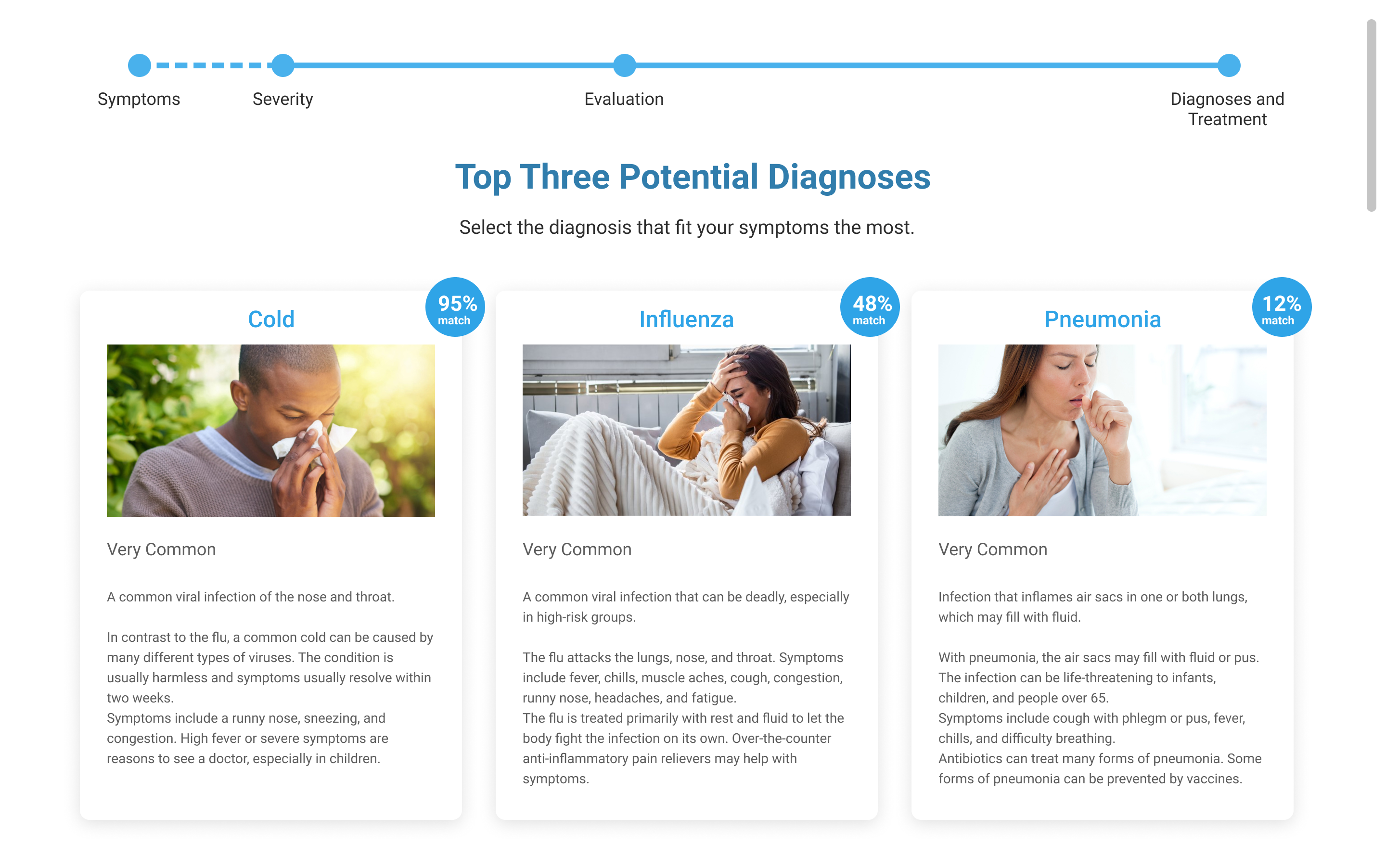
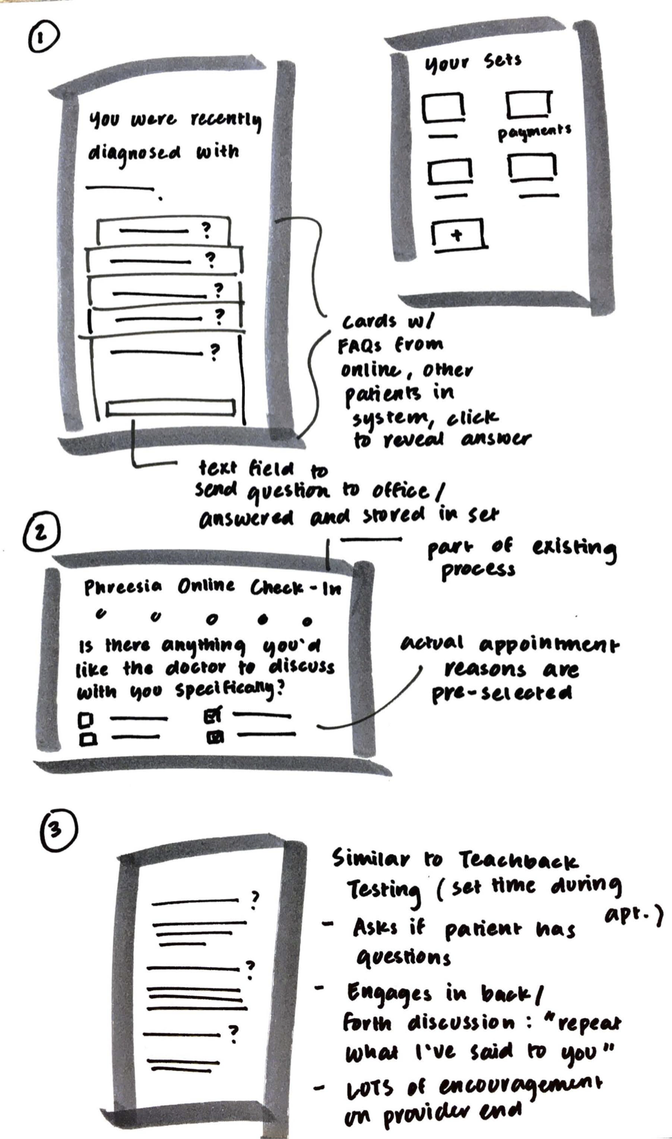
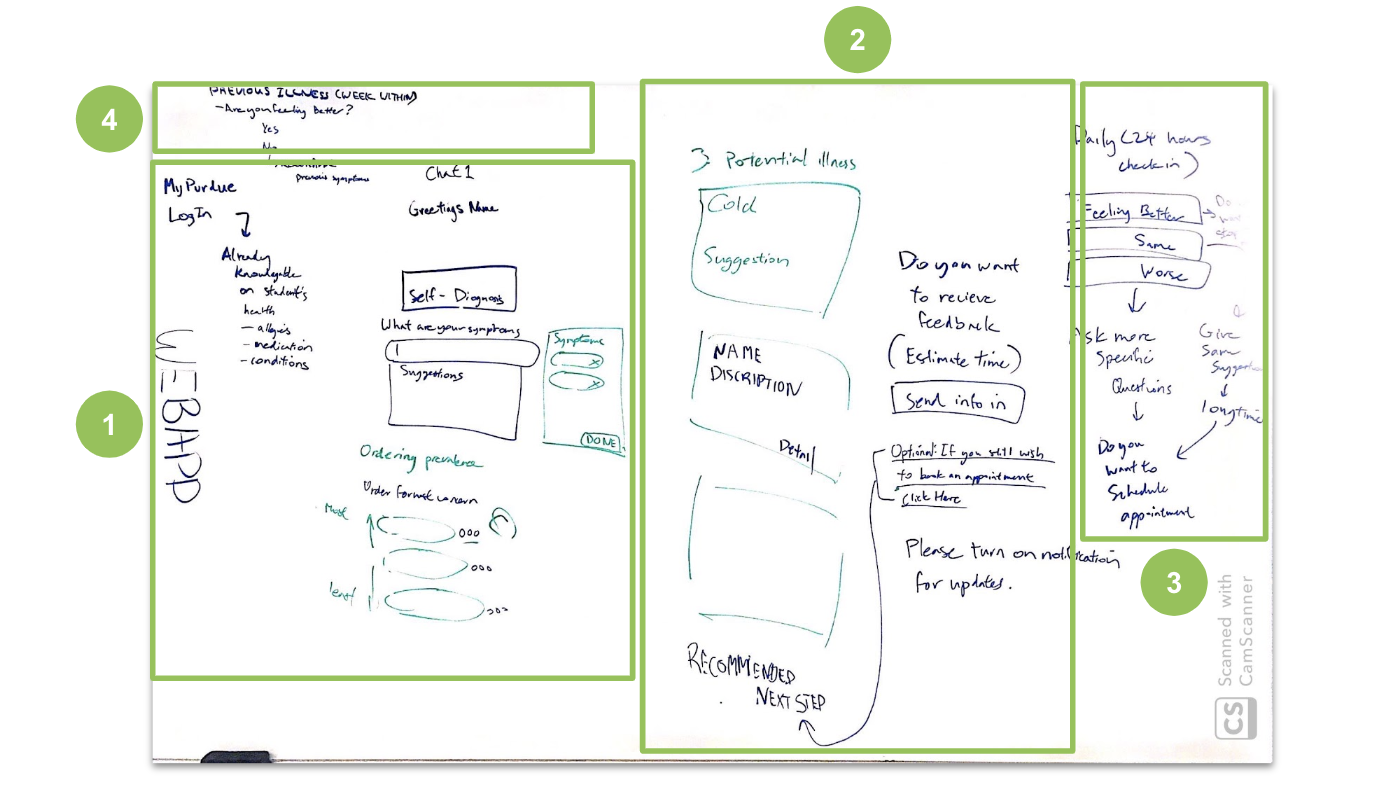
A user-friendly diagnosis tool implemented into PUSH’s existing patient portal for students to assess whether they should schedule an in-person appointment. Similar to an automated assistant, the tool guides the user to making an informed decision by asking questions regarding the user’s current state of health. These questions adjust according to the responses received. After enough information is acquired, the tool produces a list of most plausible illnesses the user might have along with recommendations for next steps.
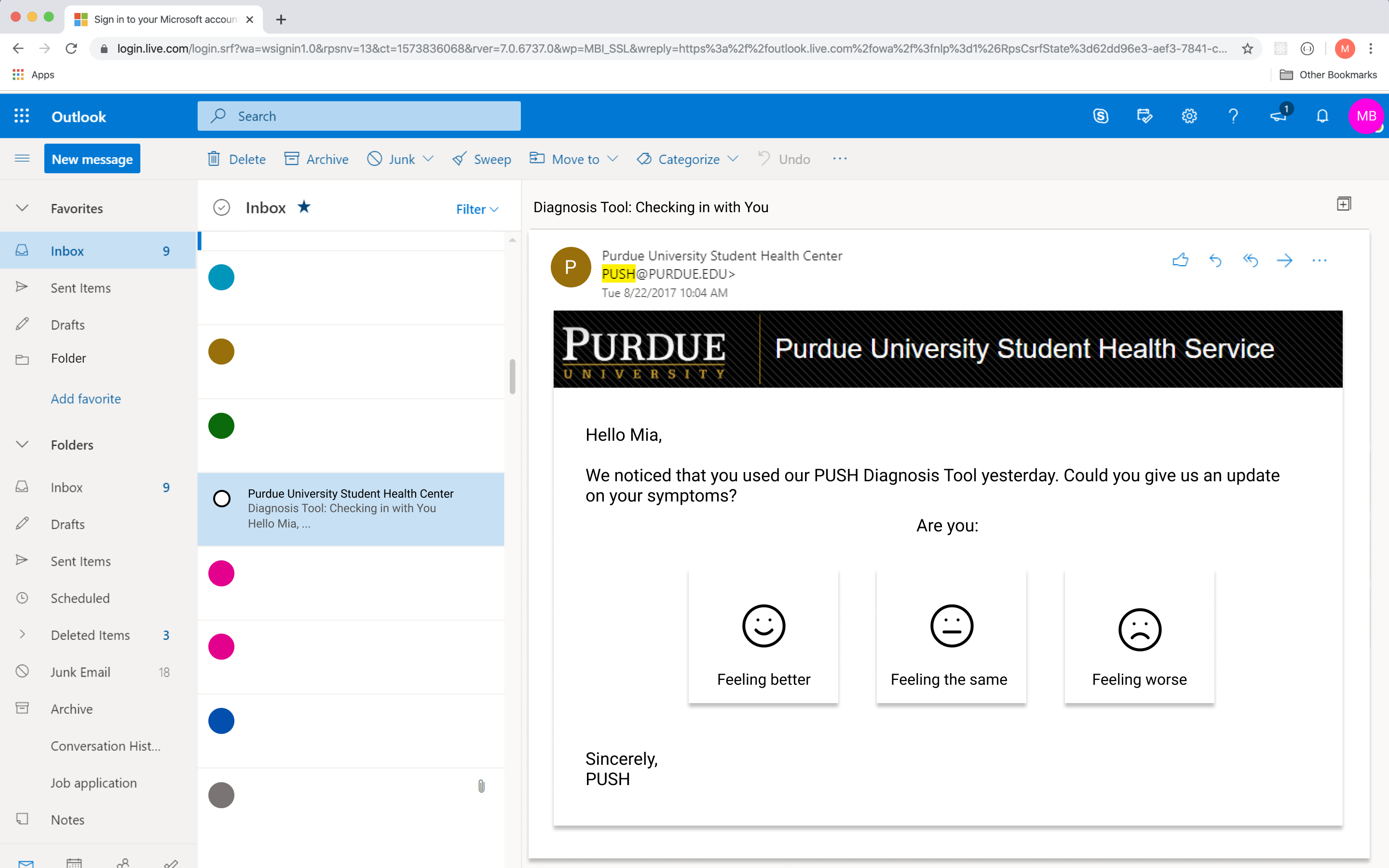
If the tool does not believe the illness calls for an appointment, students have the option to sign up for emails checking in on the student. These emails will occur at regular intervals (day after, week after, etc.) asking whether the student felt better after following the recommended steps. From this point, students feeling worse over time will have the tool automatically schedule an appointment for them. Students can stop email notifications at any time.
Research
Since the brief given to us was open-ended, narrowing our focus was essential for us to work towards tangible deliverables. Our general approach to research involved individually skimming peer-reviewed articles and other online resources for communication issues within healthcare, then working together to quickly delve into common issues identified.
From the areas we zoned in on, we decided to direct our attention toward college students – and later, Purdue University students – a user group in which the majority was not in regular communication with healthcare professionals. This was owing to the fact that before coming to college, the student’s primary caretaker would typically be the one arranging appointments.
Survey
Our goal in sending out a survey was to get a better understanding of Purdue students’ knowledge on healthcare before, during, and after their transition to college (including insurance, medical records, medical history, etc.).
We received a total of 51 responses, with the majority of responses being from 20-21 year olds. In the survey, we asked participants to rate themselves on their understanding about their medical insurance on a 1 to 5 scale (1 being not knowledgeable and 5 being knowledgeable). The average was 2.29.
We confirmed that not understanding how to seek help from the healthcare system is a problem among college students. More importantly, what makes this issue more severe is that many students don’t recognize this as being a problem until too late.
Contextual Inquiry
To get a first look at the provider side of patient-provider communication, our team interviewed a nurse practitioner at PUSH in her office setting.
- Cost is important to students. Since this was a major determinant in deciding to schedule an appointment, PUSH practitioners are instructed to make this information readily accessible.
- Students lack proper healthcare knowledge. Many students that come in do not know what health insurance plan they’re on.
- Students under-utilize their PUSH patient portal. Due to the secure nature of the tool, students do not check messages from providers consistently.
- Students do not readily voice questions or concerns. Fear of looking ignorant or revealing deeply personal information can inhibit clear communication between patient and provider.
How might we design for preventive, rather than reactive, care? How can students be aware and informed about Purdue’s healthcare resources throughout the entirety of their physical health during college?
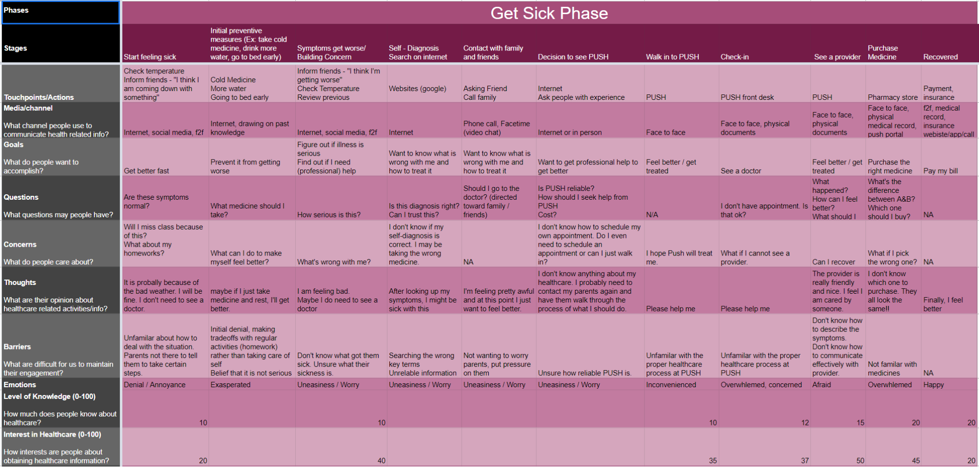
Meet Mia
Mia is an out-of-state, first year Purdue student. As a former high school soccer athlete and all-around, active person, Mia has always been in relatively good health. Her parents keep track of important medical files, such as vaccination records.
Experience Map
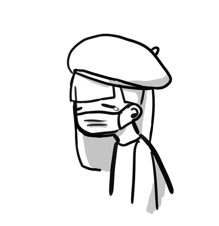
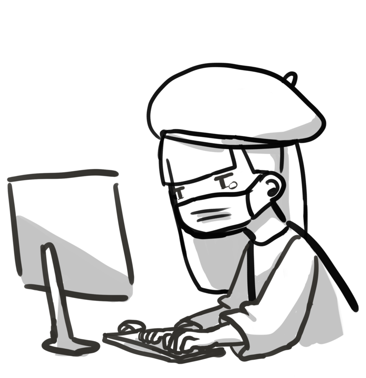
We built out an experience map in order to pinpoint what communication gaps Mia might have if she falls ill while away from home. To do this, we created a scenario in which Mia has to make a decision on her own judgment whether to visit PUSH or not. The experience map was based on the process as it currently stands. Categories explored included emotions she might feel, touchpoints along the way, the media or channel being used, goals of the stakeholders, and questions and concerns Mia had throughout her journey.
The questions “What’s wrong with me?” and “What should I do?” stood out as the most urgent communication gaps that needed to be solved.
Ideation
We ideated as a team through a group whiteboard session and built out an idea that aligned with our research and project outcomes.
The concept we focused on was a tool implemented into the current PUSH portal that would help students determine whether they should schedule an appointment with PUSH. This addressed our scope by nudging Mia into action. With this solution, students would proactively initiate interactions with PUSH. In turn, PUSH would have the opportunity to better help students navigate any physical health issues they might face throughout college.
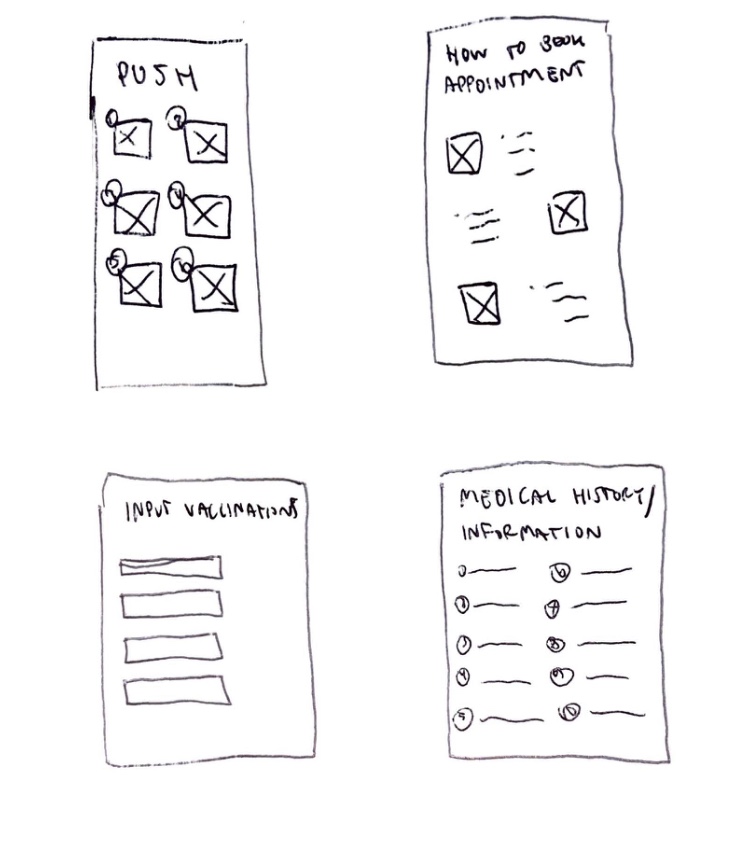
- Login into the portal and first interactions with the diagnosis tool.
- Results produced and next step options the student can take.
- Notification received from the portal a day after interaction.
- Notification received from the portal a few days after interaction.
Testing
We tested our idea’s concept and usability through paper prototypes and Figma wireframes, respectively.
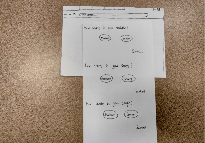
Paper Prototyping
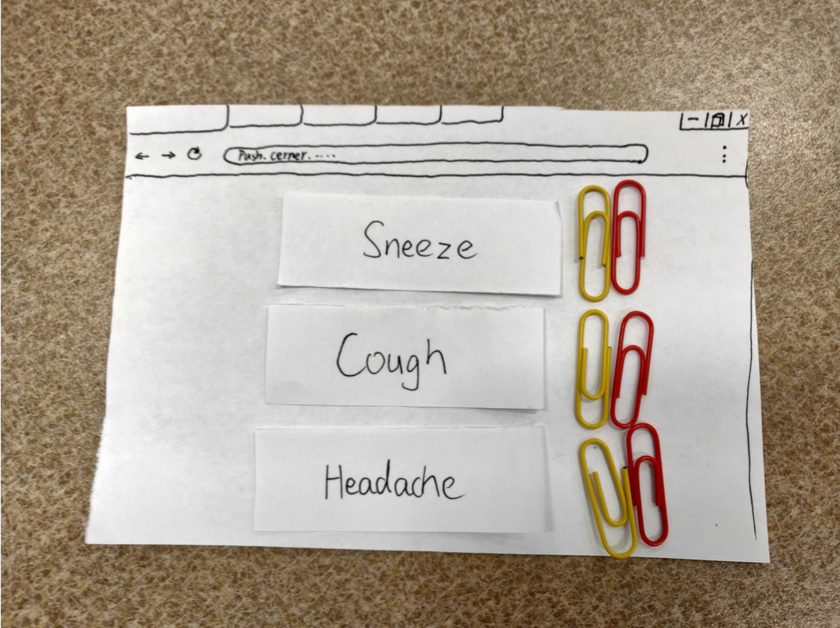
A paper prototype was created in order to determine how best to organize our screen for symptom severity (rating the level of severity for each symptom that the patient lists). This was a specific part of our concept we wanted to address, as using an inappropriate rating system in a given context can lead to ambiguity.
Figma Prototyping
The goal of testing our Figma wireframes was to understand students’ preconceived notions of software assistants as well as determine whether our idea would be adopted by our user group.
Findings
- Participants had more trust in a diagnosis system supported by the university’s hospital rather than self-diagnosing by searching their symptoms online.
- Though the length of the survey could change depending on the responses given, participants still appreciated having a progress bar to view overall closeness of completion.
- Participants wanted a more granular way to rate their severity of symptoms instead of selecting from terms like “mild,” “moderate,” and “severe.”
After taking into account feedback from both our testing sessions as well as comments from our sponsors, we made iterations to the existing Figma prototype.
Iterations
- Changed severity scale from words to numbers.
- Sectioned the timeline to better indicate user progress and the amount of questions remaining.
- Added percentages on how likely the user is to have a particular illness on the diagnoses page to emphasize that tool should be used as a suggestion.
- Represented physical feelings with emoticons in the notification email to eliminate potential bias toward picking a certain color.
Reflection
This diagnosis tool implemented into PUSH’s patient portal is meant for students to make the first steps toward taking care of their health. Our concept encourages patient-provider communication by familiarizing students with the portal, intended to address the uncertainty that comes with getting sick without the presence of caretakers.
Because of the exploratory nature of this project, careful research and planning was critical in achieving a user-centric solution. Unfortunately, our haste to scope down quickly led to oversight in these areas. Nevertheless, I believe that our group was able to successfully pull together a solution that addressed a real need in our community.